Go for a walk somewhere local. Find a view that you like or are familiar with and use your viewfinder to help you focus on a point of interest. Make four sketches during your walk. You’ll be drawing rapidly and you may make mistakes – but don’t rub anything out. You can draw over any mistakes and re-state what you want to depict. Try to capture the idea of what you see through drawing; think of your sketching as taking notes. Try to get everything in, no matter how roughly. Fast drawing helps you to concentrate and see more clearly, shutting out unnecessary ‘noise’.
I chose five quite different views for this exercise on the basis that each one appealed to me for a different reason.
Courtyard: This view of my back garden attracted me because of the repeating shapes and colours of the pots strewn across it. I also was interested in the play of light- bright on the right and dark towards to back. there is not a lot of foreground in this sketch, maybe this would change if I homed in on the top left two thirds of the page.


View from Lymm Dam: I was attracted to this view of the Dam, with the railings in the foreground leading the eye across the page and the focal point of the church in the background. In a more developed picture I would make sure this was not centered. There might be some interesting reflections in the water below the trees and the view contrasts with the dark shaded area in the foreground. There is definitely a fore-middle and back ground in this sketch and texture is added via the vegetation and reeds in the centre while the trees behind are shrouded in mist. The railings give a strong shape and if it were detailed more would be highlighted and gain mass.


St Mary’s Churchyard, Lymm: I spent some time looking at the church from a closer position. I like this view as it is framed by the trees. It is a cold, misty damp day so the light/dark contrasts are minimal. I did a pencil sketch at the scene then outlined it again at home. I like the shapes of the gravestones and the way their surfaces sit either in the light or in shade. The light is coming from in front of me at the right. Under the tree all the stonework is in dark shade while behind them the stones are lighter. There is fore ground (headstones and the edge of the tree I was standing under) middle ground (tree/ church/ headstones) and background (trees and vegetation). I like the contrast of soft vegetation against the hard stonework.


Lymm Dam: I was again attracted by the view framed through the tree in the foreground. In the middle-ground is the water and a couple of birds and reflections of the trees and a misty bank of trees and the dam make up the background. The tree at the front is dark and almost silhouetted. There are interesting shapes in the dead tree at the bottom and the branches hanging down. I like the shape of the gnarled tree trunk and the twee addition of a nesting box. There is more light/medium/ dark tonal contrast in this scene. I am not sure I captured this, but would work on this more if I developed the work.


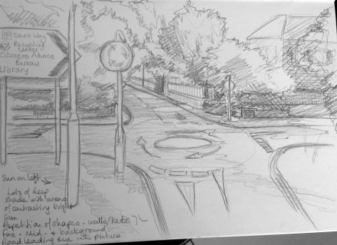
Brookfield Road: My final sketch is of the mini-roundabout outside my house. I was walking up the hill and was struck by how the road curved away in front of me and, as it was a lovely sunny day, by the intense shadow and sunlit areas. I like the way the roundabout occupies the centre of the page but leads your eye away in four directions. I like the shapes on the signage and the road markings and the abstract shapes of the tree-shadows on the road. It has a sense of depth, the nearest lamppost sitting in the foreground, while the road disappears into the background.

Concentrate on drawing clouds, creating comprehensive tonal studies in your sketchbook using charcoal, oil pastels, conté sticks and other tonal media. You can also use a putty rubber to lift out the lightest tones and add texture by erasing small areas, leaving pale and expressive traces of paper beneath the medium. Take time to study and observe the weather conditions. Take account of movement. Go out in different weathers and make small sketches of patches of sky and clouds.


I tried using pastels on grey paper thinking that the paper colour would represent the tone of the background sky. I tried to contrast the light and dark areas of the cloud against the background.
I did some quick sketches in my sketchbook to play around with some ideas using graphite pencils, water-soluble graphite pencils, and pen and ink. I tried using a water wash over the non-permanent ink but it created a very dark wash. I also had a go with charcoal and decided I would develop the use of this medium more on a larger scale.


I tried smudging pastels on a tissue and applying it to the paper that way to create a more subtle colour. I was careful to leave white paper showing through. I realised that I was finding it easier to draw clouds when there was something terrestrial grounding them. They look like clouds over trees or a building, but if I take the building etc out it just looks like a smudge.


These two cloud drawings are on A2 cartridge paper using charcoal. The first attempt shows more definite marks and creates billowing shapes and a threatening, stormy sky. The second attempt is more smudged and evokes a stiller day. Both work in their own ways, creating the sense of different weather conditions.


Having tried out these various techniques I decided to try to organise my pastels from dark to light colours and to use these to try to capture the contrasts and tonal effects. I decided just mix up the colours, thinking solely in terms of tonal value, and to see if I could still give the cloud volume and shape.

This was my first effort, which I checked by converting the photo to monochrome:

I was excited that it really liked like a cloud once the colour was removed. So I tried this effect again using more colours on a more classic shapes cloud. This was a fun approach, resulting in a fairly abstract cloud, which appealed my analytical nature and taught me a bit about how to use colours in their tonal range.
This drawing demonstrates the artist’s ability to be selective and simplify the scene. Spend one to two hours on this exercise. Work in a wood or study a group of trees. Foliage will provide its own contrasting tonal areas, Try to work in broad tonal areas. Look for strong contrast in light or dark or intense areas of colour. Your drawing should suggest form and mass, but don’t get stuck with detail.
I really didn’t enjoy this exercise. I had to restart 2-3 times looking at different clumps of trees and the first ones seemed to just be a mess! But I settled down determined to simplify the subject as that was where I was going wrong- getting sidetracked into defining branches and leaves too much and too early on in the drawing.

In the sketch above the light was difficult to capture as it was mostly coming from behind and mainly hitting just the left side of the left tree (conifer) and the top of the middle tree. The right one was an elegant tree which receded into the dark shade and background and with the sun in my eyes I couldn’t see it properly. So I gave up and tried another group of trees in a different direction:

This time I tried using tinted charcoal pencils, but even the outline sketch started to get too involved. I was really struggling with the concept that a bank of trees is really a large swathe of green(s), but with only two greens in my range of pencils it started to get very monotonous. I wasn’t even going to include this but felt I should show my failures!!
The next attempt was done while sat in the car outside my daughter’s ballet lesson. The advantage this gave is that I tended not to rush as I am trapped for the hour and killing time! The larger trees were coming into reddish berry and starting to turn brown on the tips of the leaves. I started using a pen and then added some colour using watercolour pencils. This time I felt there was depth to the picture with the deep shade under the canopies and the light areas where sun was hitting the leaves. I liked the fact there was a dead tree in the middle giving contrast of shape and a tree with a completely different growth habit on the right. Even though this was a fairly quick sketch I felt in retrospect that it worked.


I had another go at home looking at a bank of trees in my garden. It might not have been a great choice as they are very mature and growing closely together, however I liked that they were in bright sunlight so they had strongly defined shadows. Because of this I found it easier to look at them from a less fussy and detailed perspective.
The dynamic forms in this picture came mainly from the different shapes of the different species of trees (Yew/ blue conifer/ deciduous- I’m not good a identifying them!) as can be seen in the accompanying photo.
I had to think about how to differentiate the shapes of the different species and to make them look different from a row of lollipops. As I developed the drawing and intensified the shadows and really dark/light areas of contrast it started to come alive and I increasingly enjoyed doing the drawing. The fir tree in the centre works particularly well. The one I struggled with the most was the yew tree on the left- the branches tend to curve upwards slightly while the twigs/leaves curve hang downwards raggedly and I found this very hard to capture. However, as I concentrated on areas of light and dark even this tree gained shape. Overall there were lots of bits of branch/trunk between the leaves that I could see, but I didn’t want to over emphasise these- I tried to hint at these areas with lines and shading within the shading… I think it just about works. I tended to crosshatch the shaded areas and wonder if this gives the drawing a technical flavour- maybe it would have been better to shade them.
I wonder if ink and a wash might have simplified this composition and created more light/dark contrasts?
- In order to distinguish one species of tree from anotherI tried to capture the growth habit of the trees in terms of shapes of leaves, branch, silhouette, direction of growth, shape of clumps of branches.
- The mass of foliage and the spaces between was conveyed by creating a sense of 3D form using shadow and light areas. (Much as you would if you ere drawing a sphere!)
- I tried to capture light on the trees by using three main tones, dark, medium and light so as to keep the shapes simplified.
Choose an expansive landscape where you have an open view in all directions. Start one drawing looking north. Use your viewfinder to find a focal point, frame your view and complete a 15-minute drawing. Then turn your stool on the same spot to face west, south and east. Each time repeat the process of finding a focal point and complete another 15-minute drawing. This exercise should teach you how the landscape view changes by just shifting your viewpoint slightly. Many artists return to a favourite spot and, simply by shifting their viewpoint, see something entirely different in the landscape.
I chose to do this exercise from the middle of my local park, because the views are expansive. I achieved all four pictures in about 15 minutes each.
NORTH
This view looks out towards the M6 beyond a football pitch surrounded by trees. The sun was coming from the south to inspire of the fact there was bright sun, there are few really defined shadows falling across the grass. It was such a beautiful there was little to observe in the sky either- no clouds! The motorway lights were twinkling white in the distance over the road and there was deep dark shadow under the flyover and within the trees, especially on the left of the pitch.


EAST
This view was interesting, but complex, to capture. The path leads through a row of trees, beyond which is a playground. The sun put deep shade under the trees, but beyond parts of the playground were still in bright sunshine. Beyond that there were more trees- again in shade. As I was drawing from a distance I couldn’t home in on some of this detail, but hope I captured the sense of it. I think this was the first time I really managed to do a quick simple sketch of a group of trees without getting hung up on being overly accurate! I like the way they are planted in a row, and the repetition of their trunks and the space between the trunks.


WEST
Looking towards houses to the side of the park. This time there is dark defined shadow rom the trees draped across the grass, which gives more of a sense of sunshine. This sketch also contains repetition in the shapes of the roofs. The path leads the eye through the sketch.


SOUTH
Although this direction was probably the least appealing in reality I think the sketch is the more interesting of the four. Mainly because the trees have more variety and shape. The houses were interesting to draw and there is deep shade on the bank under the hedges. The sun was coming from in front of me, but there is no real shade from the trees on the grass- I hadn’t noticed this at the time, but it was the middle of the day so the sun was probably high and I was standing low down at the level of the path. Beyond the path there is a bank which rises up and puts the top of the bank at my eyeline, at the level of the shadow in the background. When I look at the thumbnail photo of this view, taken from above the bank, there IS shadow, and It is clear that the bank is shielding tree shadows from me.


"Drawing is putting a line round an idea." Henri Matisse (1869-1954)


