Category Archives: Pt 4/project 3

Part 4, Project 3, Exercise 4: Energy

Ask your model to adopt a ‘dynamic’ position – lifting an arm, twisting the hips, turning the head, stretching the arms or walking. They’ll need to be able to hold the pose for about five minutes.

Work on sheets of A3 paper and, using charcoal, brush pens or other tools that allow for broad and sweeping marks, quickly sketch the figure. Try to convey the sense of energy in each pose. Don’t worry about details – concentrate on the sense of movement in the figure.  Rapidly drawn, flowing, undulating lines can create the effect of movement. Lines repeated and close give the impression of movement. 

IMG_1231

These sketches use a brush pen in an attempt to convey energy, but as a first go I felt these were rather constrained.  They work in that they don’t labour over detail and just use rapid sweeping marks to convey form, but they’re a little too “exact” that renders them rather static.

IMG_1230

These sketches use pencil to again attempt to convert energy.  The pencil marks are less exact but they are still rather static.  In part I think this might be due to the pose, but they also focus a little too much on detail (in spite of trying not to) and again appear rather constrained as a result.

IMG_1263

For this pose I switched to charcoal, which I found much easier to approach with  flowing, energetic lines.   I am pleased that I have captured a sense of movement, a moment in time, whilst not labouring over detail.  Form and shape is implied by shading and undulating marks placed to enhance the sense of the musculature and skeletal form beneath the skin.IMG_1264

Again, using charcoal these sketches capture the models’ poses without labouring detail.  I have not added much shading so the drawings are mainly contour lines.  The left pose is rather awkward but does capture the position of the model (knock-kneed and tilted to one side)

IMG_1265

In this charcoal drawing I added more shading to give a sense of form, but tried to simultaneously ignore detail.  I am pleased with the sense of 3D form that resulted.

IMG_1274

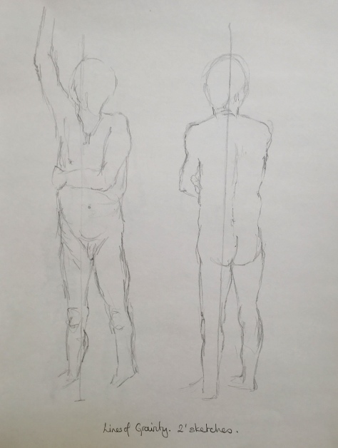
In these quick sketches I resorted to graphite pencil and the resulting drawings tightened up a little again.  However, I enjoy the process of creating a sense of form using sketchy lines and I feel free from the need to get it correct first time.  The multiple lines in some areas add to the sense of movement/ transience of the model’s pose.IMG_1273

I tried using different colour brush pens to create a sense of movement- the yellow pose works quite well I think, but the other two were both out of proportion and/or more constrained.  the lines were more laboured and tighter, while the yellow lines are more free and less laboured.

The following sketches were all done on a smaller scale in my sketch books.  I particularly like the first one of the reclining male nude and wish I had done this in a larger format. In these first two drawings I was trying to experiment with fluidity of line and gestural marks to describe essentially static poses.   I thought they were, on the whole, relatively successful. IMG_1267 IMG_1268

The drawings below were trying to capture more of a sense of movement.  I had to work quickly and without worrying too much about being absolutely accurate- the repeated marks, the poses and their loose style give a sense of flow and movement within the subjects.

IMG_1269 IMG_1270 IMG_1271 IMG_1272

Part 4, Project 3, Exercise 3: Stance

Look for the line of balance or the centre of gravity in a standing figure: it begins at the top of the skull and passes through the middle of the nose, straight down the middle of the chest cavity. With a back view, the line starts from the back of the neck on the spinal column. From a side view this line of balance starts at the back of the ear and travels down to the weight-bearing foot.  The line indicating the central axis also helps indicate where the body mass or majority of the body weight is placed. If the figure moves or if the model sits down, the weight or mass changes to a different area of the body.

Move around the model before you begin to draw to get a sense of where the figure is in its allotted space and to identify its centre of gravity and gesture. Mark the central axis in your initial sketches of the standing figure. Ask the model to change poses every two to five minutes. Draw as many quick poses as you can.


IMG_1224IMG_1223IMG_1222

In these quick sketches explore where the central axis is and also where the majority of the body mass is directed.  This is marked as an arrow through the body on the drawings.  As weight is distributed from one leg to another the head tends to follow and a plum line dropped from this point helps to locate the direction of the body weight.  It is harder to see in a crouched pose.    These studies will be useful as reference material for future work.

Part 4, Project 3, Exercise 2: Essential elements

Draw a sequence of six different poses lasting ten minutes each. Adjust the light so that it hits just one side of the model, to emphasise the three- dimensional form. Take time to look at the model and identify the darkest and lightest areas. Remember the basic shapes and begin to shade in the darkest tones.  Build up the different tonal values with loose hatching and/or broad sweeps of dark tone. Leave the white paper without marks for the lightest tones.  Draw the whole of the figure, and don’t concern yourself with detail.

IMG_1219

I am pleased with this drawing.  I used oil pastels on toned kraft paper so I could concentrate on shading.  (I prefer to use toned paper and to mark in the lightest and darkest areas, rather than use white paper and mark in mid- and darkest tones.)  I think this drawing was quite well observed, the proportions are good. I like the way it fills the paper and how some parts of the figure go off the page.   Even though the lighting was not bright enough to create contrasting  tonal values, the end result is fairly convincing.  The only bit I am not happy with is the chest area- which is oddly shaped and looks a little like the male model has breasts!  The model is sitting at an angle away from me.

IMG_1220

This is another attempt at the same pose as above, but using various tones of skin-toned marker pen.  The proportion of the rear leg is not right- it is too short compared with the other leg and the rest of the body.  The pens were hard to control- the darkest areas are fairly accurately observed andI generally think the tonal effect creates a sense of weight and three-dimensional form.  I like that the pens discourage me from outlining too starkly.


IMG_1238

This was an experiment with marker pens, using various colours instead of skin-tones to depict the different tonal values.  There is a twist to this pose because the model’s legs go to her right while she is looking towards her left and her weight is going through her right hip/buttock.  There is definitely a sense of weight and 3D form in this picture, particularly due to the use of the pale yellow highlights and the area where white paper shows through on her lower leg.  I did use a fine pen to outline the shape to prevent it becoming a muddled mass of colour blocks.  I would like to try this again taking more care to isolate and separate the different tonal values.


IMG_1235


IMG_1229

The two drawings above use skin tone marker pens, depicting the areas of shade/light across the body.  The standing pose works best- there is a more definitely sense of directional lighting coming from the model’s right (our left).  The shading helps to confirm this.  As a result the effect of form is also more convincing and even though I have outlined the figure I have used a mid tone pen so it is not too dominant.    In the seated pose the highlights are a little confused- hitting the torso from the front and the back.  This may actually have been true as the room has windows all around but the sketch does not work so well..  In both sketches the proportions are generally accurate, although the arms of the seated pose may be a little skinny.


Part 4, Project 3, Exercise 1: Basic shapes

Arrange your model at a slight angle in a chair. Establish that they will be comfortable to sit in this pose for an hour or so (with breaks). Before you begin your drawing consider the angle of the central axis that runs through the seated figure. Notice any twists or bends.

Block in the basic shapes. Look carefully at which planes of the body are receding and which planes or lines are parallel to the edge of your picture plane. This will help you establish the bulk of the drawn figure in relation to the space around it.

Identify a measured unit that will help with the scale and proportions of the figure. Draw the model from different angles and positions. Remember to look and measure with each pose.  Identify the possibility of foreshortening and make written notes. Is there more than one line of movement? The torso may have a slight twist to it.

IMG_1228

This is an interesting pose because the model is seated in front of a mirror.  His back has a very slight twist due to the positioning of his arm on his knee, whilst looking across at the viewer over his shoulder.

The plane of his shoulders are receding from the viewer.  Since he is sat upright, his back and lower legs are parallel to the edges of the paper.  The top of his leg is horizontal.  In the mirror view his leg and arm seem to go away from you , which is strange as they appear horizontal in the actual pose.  However, it probably reflects the fact that I was at a 45 degree angle to the mirror!  There is foreshortening in the reflected  leg and the models shoulders appear narrower than they do in their reflection.

I think I have captured the essence of this pose.  There is a realistic twist to the torso (albeit slight).  The body is in proportion (apart maybe for the head??)  Once again though I am disappointed in the results using graphite pencil because the outline is over pronounced and the shading is a bit contrived and unnatural!  I could have added a greater sense of presence by adding shadows, context and background.

IMG_1249

In this pose the model is sitting straight on with his hands held between his knees- albeit at an angle to me. Using graphite pencil  I Blocked in the basic shapes first; of the torso and arms and even had a more detailed attempt at the head than I have previously.  I was pleased with the result, which was almost a likeness!!  However, there has been a bit of a disaster with the legs, which are too short and skinny and leave the model looking rather dwarf-like!!  There is a sense of form through the sketchy shading, but the outlines are heavier than I would have liked.  I wonder if this effect is exaggerated by the fact there is no background and the figure is basically contrasted against  plain white paper!!  Had I shaded in shadows and a darker background the darker values of the outline might look less pronounced.

IMG_1247

This is another attempt at the pose above using more experimental media- I like the use of unrealistic colours.   I tackled this using neocolor II water soluble crayons.  I shaded the main areas of light/ dark and then medium shading, before using a wet brush to create a wash and merge the areas of shading.  I only added the outlines afterwards, working into wet, using a contrasting colour.  At first I really did not like the result, but when I looked at it more objectively from a distance later on, I realised that it has a freedom that the more detailed pencil drawings lack.  There is definitely a sense of 3D form through the use of shading.  The proportions are more accurate although the hint of a head may be a little on the small side?.  I rather like the drips too!!  The reason I did not add background was that at the time of drawing this I became frustrated and disillusioned by the results so I gave up!  However, I wish now I had continued to add the stool and flooring/background shading.  There is foreshortening in some of the proportions- the fact the body tilts away from me means that it is narrower than it would have been were it face-on!